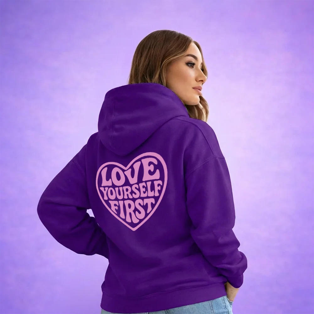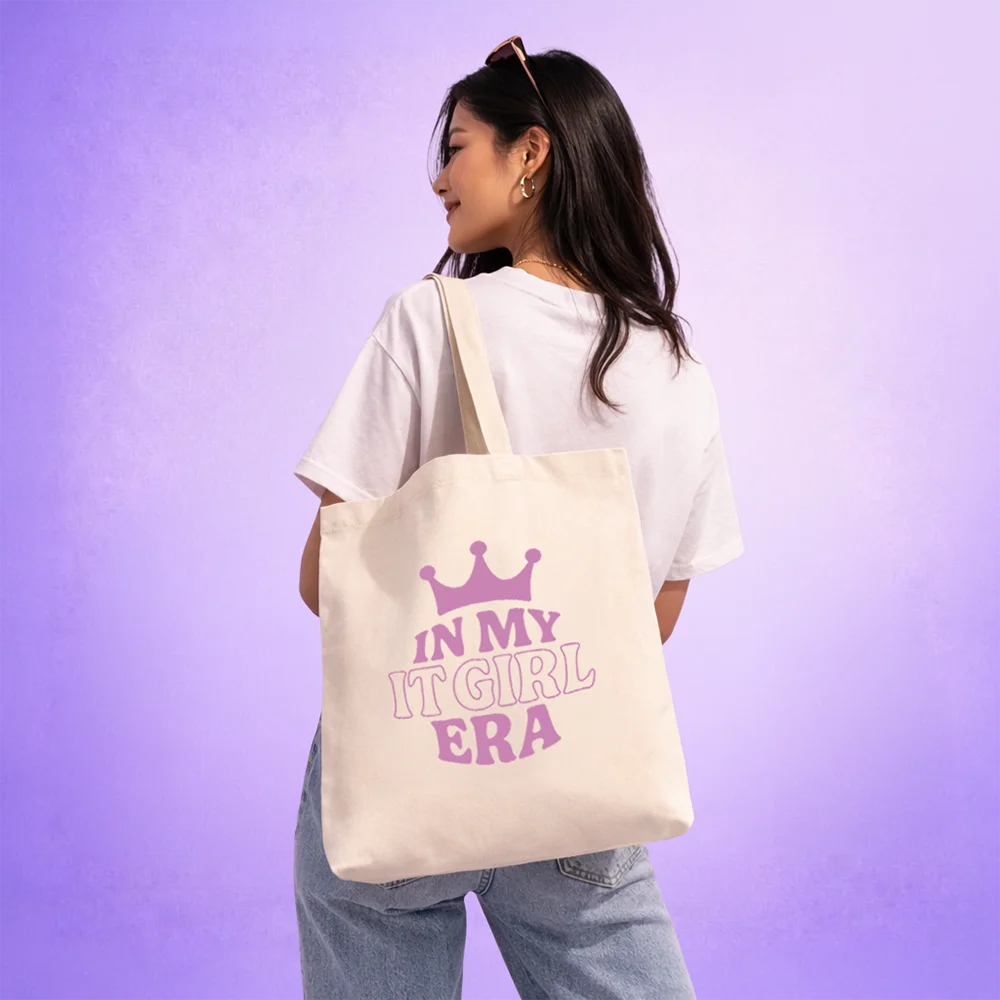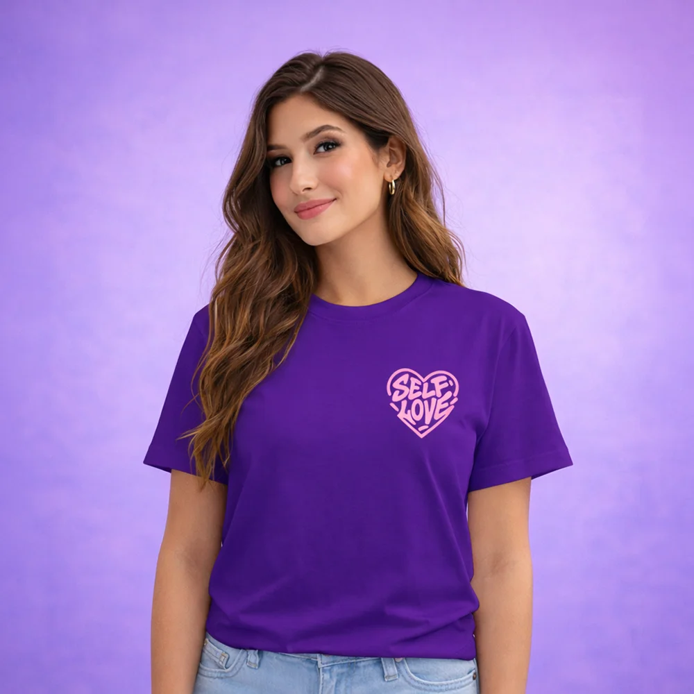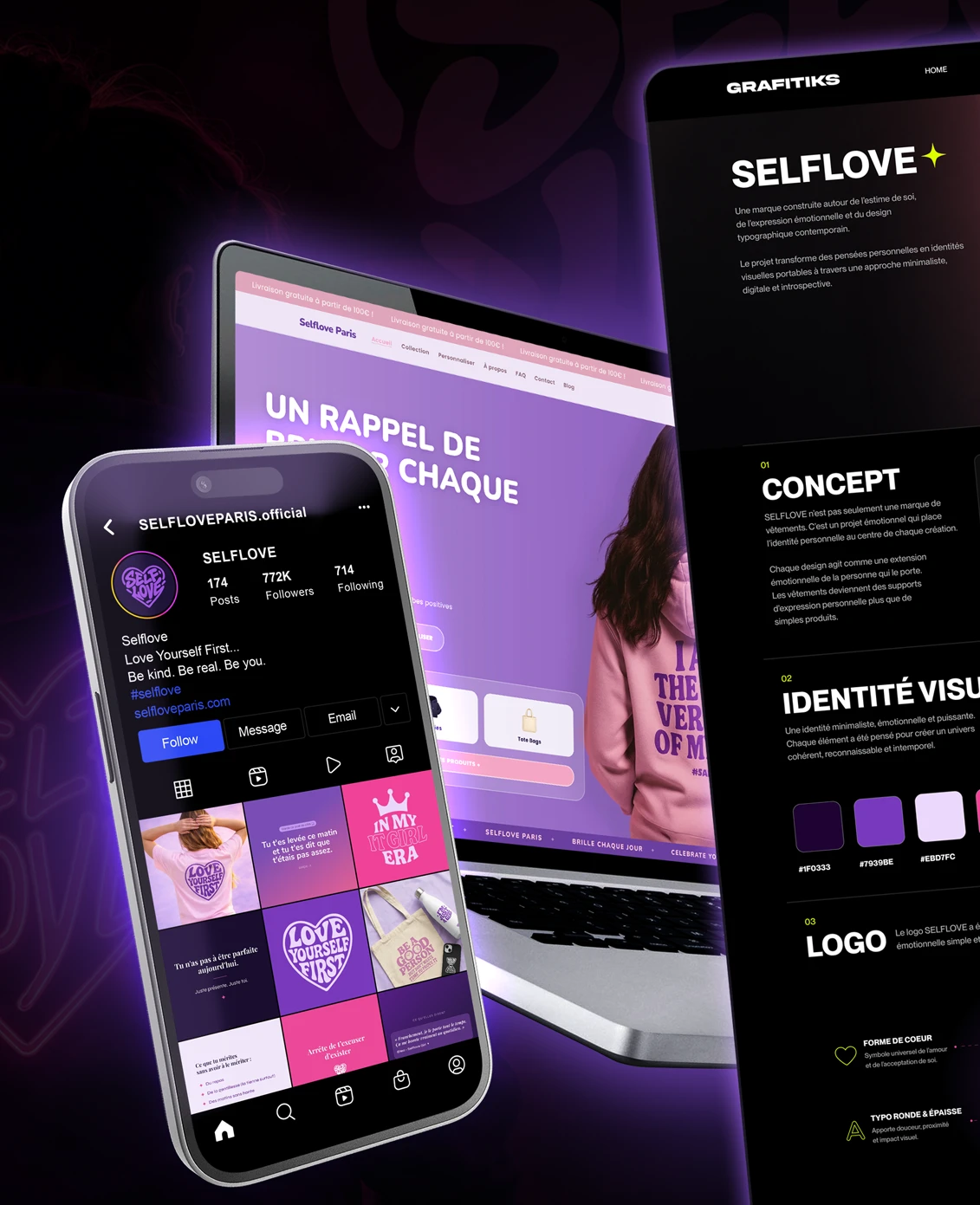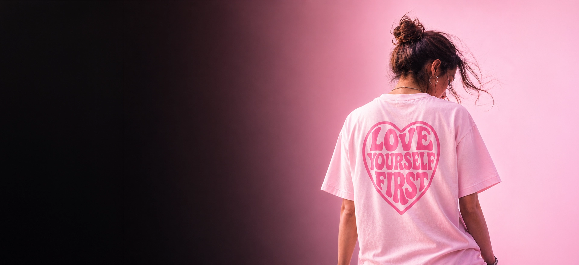
A brand built around self-esteem, emotional expression and contemporary typographic design.
The project turns personal thoughts into wearable visual identities through a minimalist, digital and introspective approach.
01
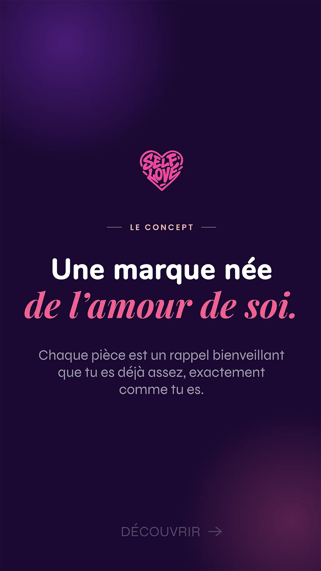
SELFLOVE is more than just a clothing brand. It is an emotional project that places the individual at the heart of every creation. The clothes become vehicles for personal expression rather than mere products.
Words that give a
shape to what is felt inside.
Phrases designed to nurture
confidence and reveal inner strength.
An aesthetic created to
reflect a unique personality.
A space conceived to welcome
thoughts, doubts and inner impulses.
A bond created around
shared sensibilities and values.
Every creation finds
its own resonance.
02
A minimalist, emotional and powerful identity. Every element was designed to create a coherent, recognisable and timeless universe.
MONTSERRAT
Used for the interface, body text, descriptions and the overall site structure. Clarity, modernity and stability.
NUNITO BOLD
Used for messages, secondary titles and emotional elements. Softness, closeness and human impact.
03
The SELFLOVE logo was designed as a simple and instantly recognisable emotional signature.
A universal symbol of love and
self-acceptance.
Brings softness, warmth
and visual impact.
Instantly legible,
even from a distance.
Works across all media:
clothing, social media, packaging...
04
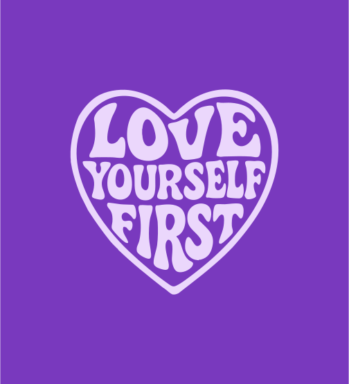
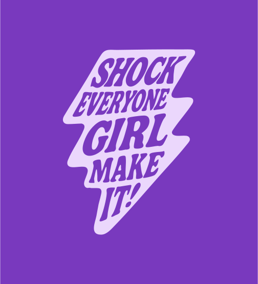
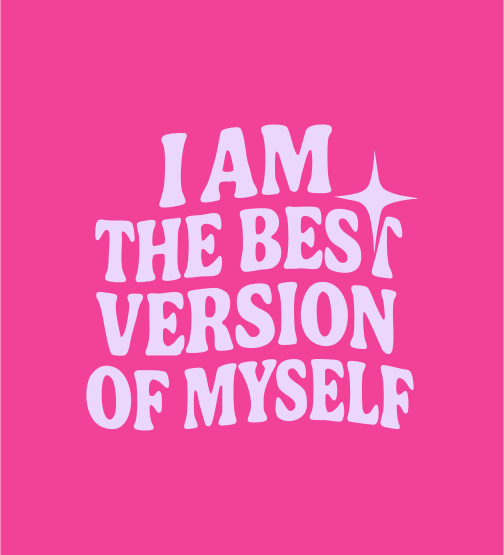
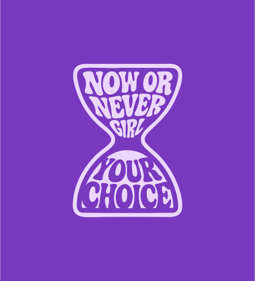
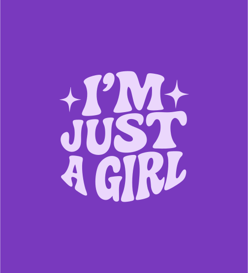
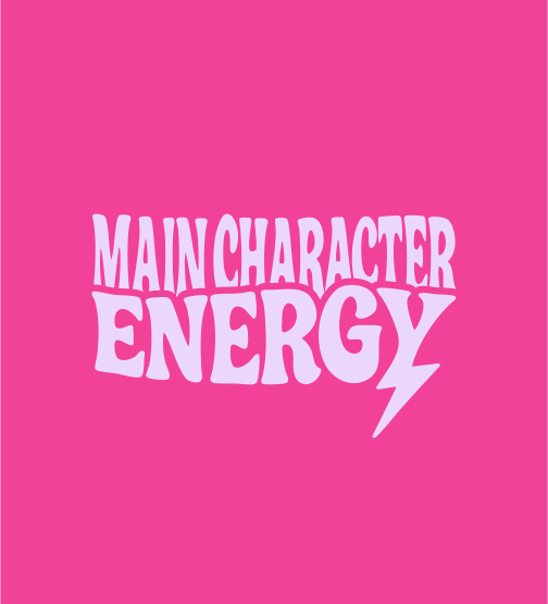
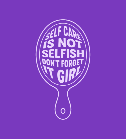
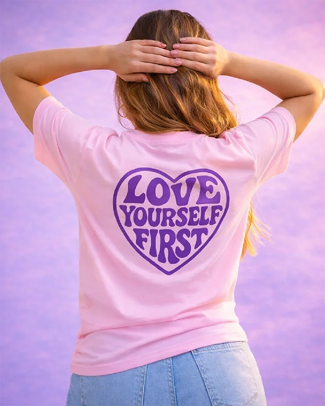
A visual language built on typography, repetition and rhythm. Every design becomes a message. An emotion.
05
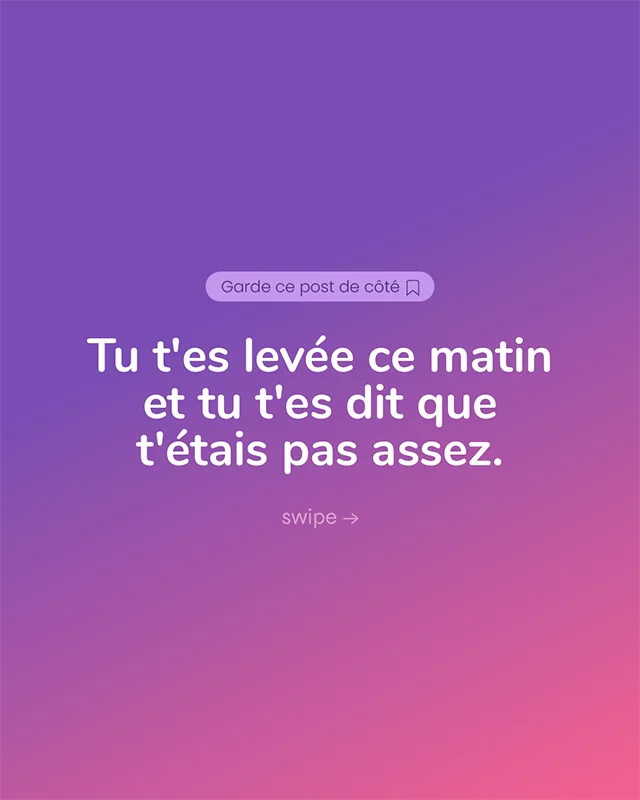
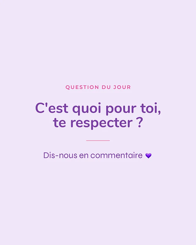
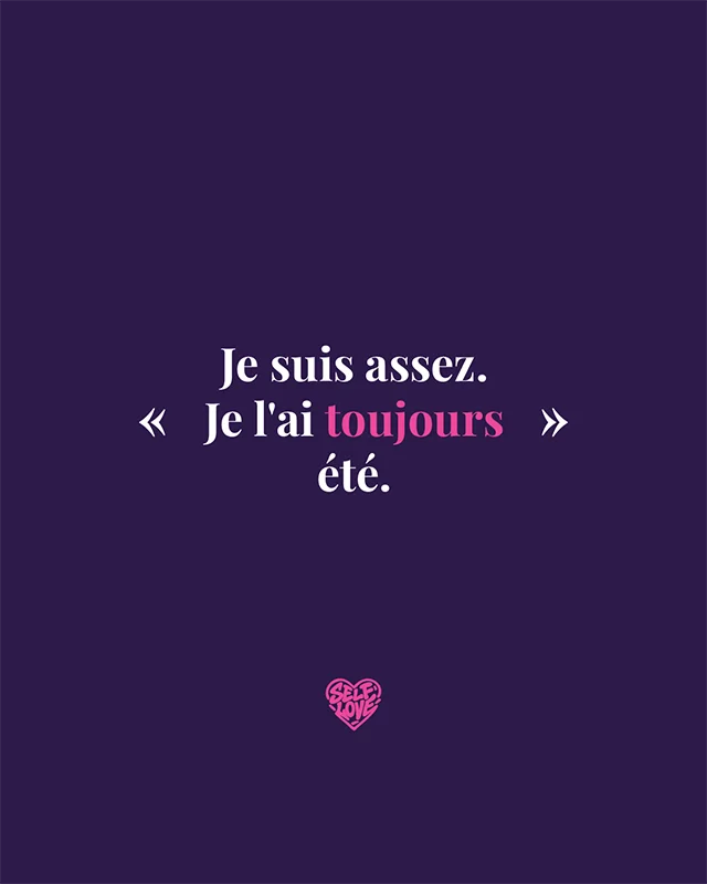
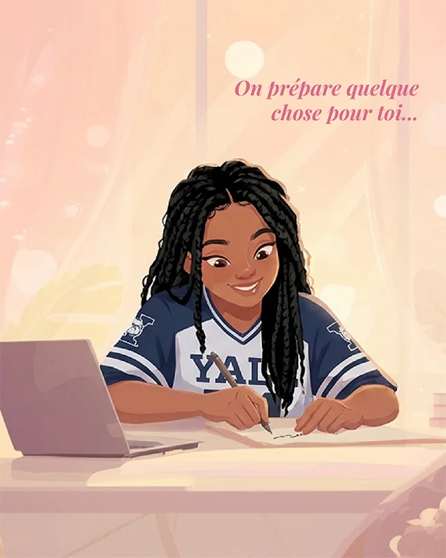
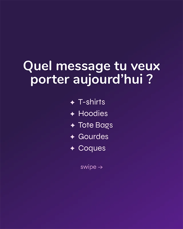
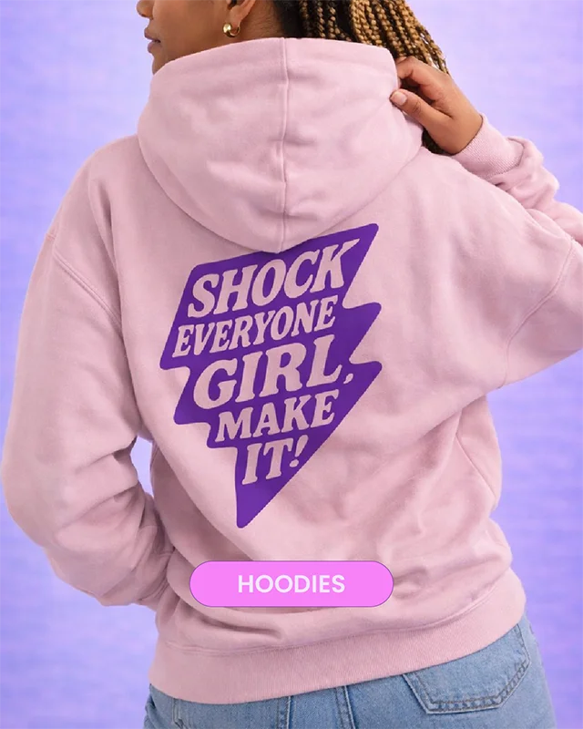
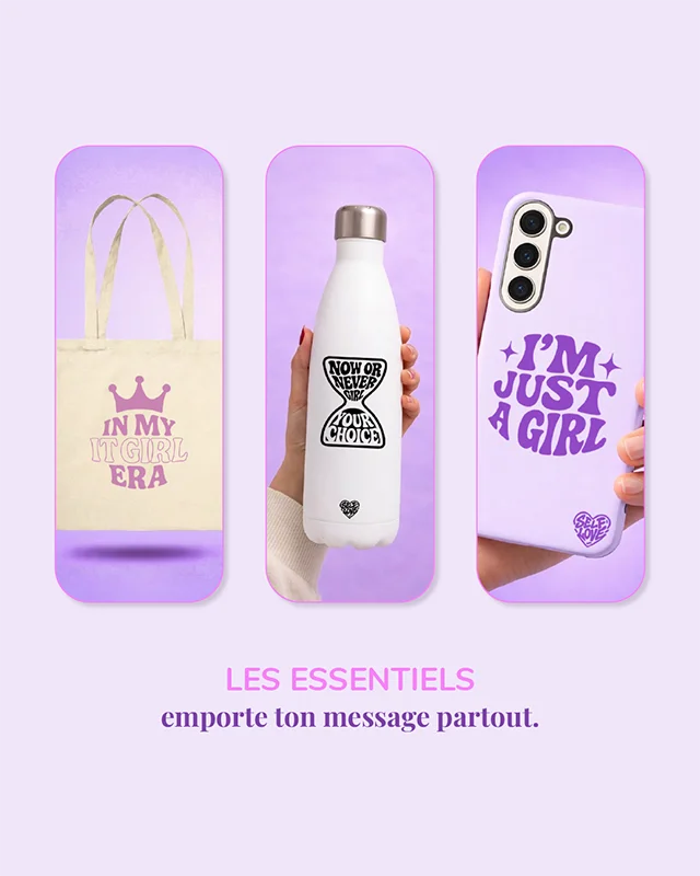
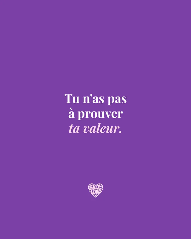
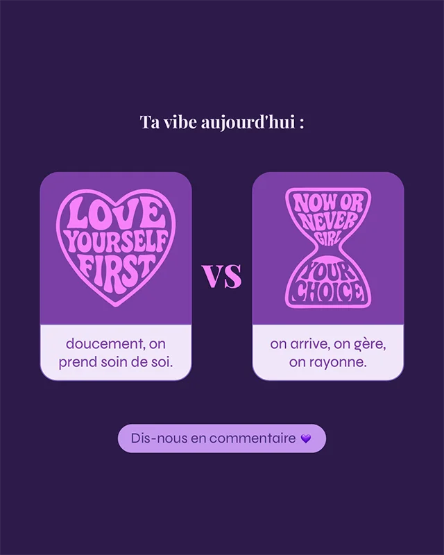
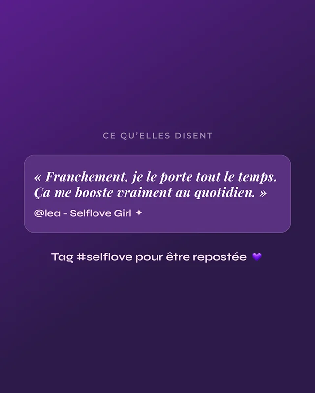
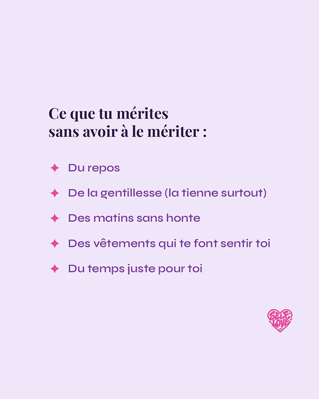
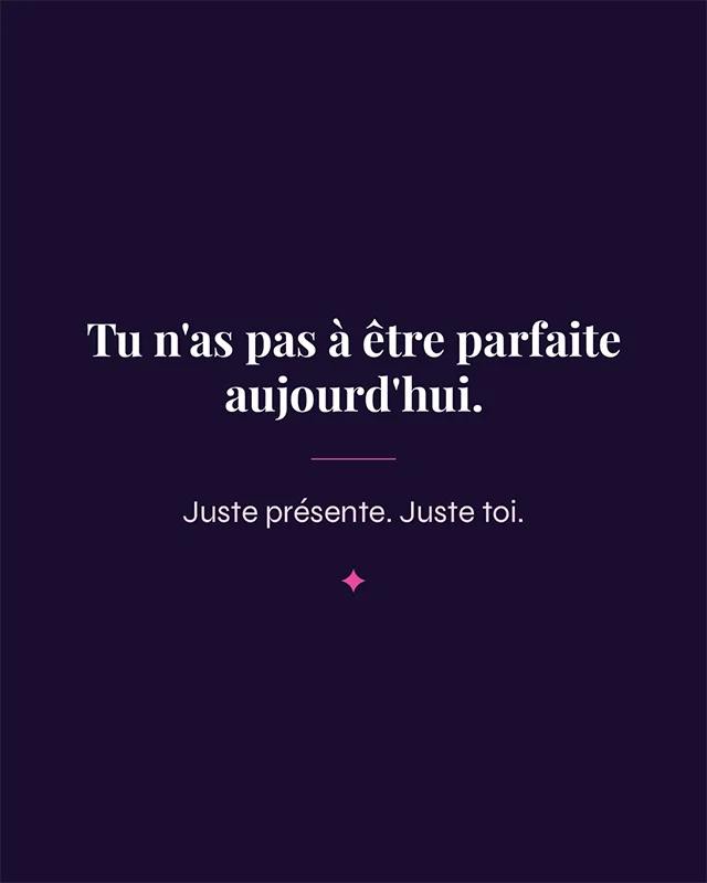
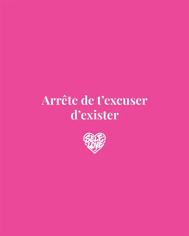
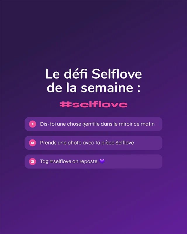
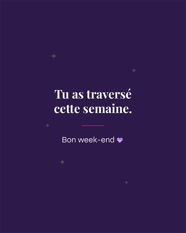
A content direction designed to create a coherent, emotional and recognisable digital presence. (Instagram posts)


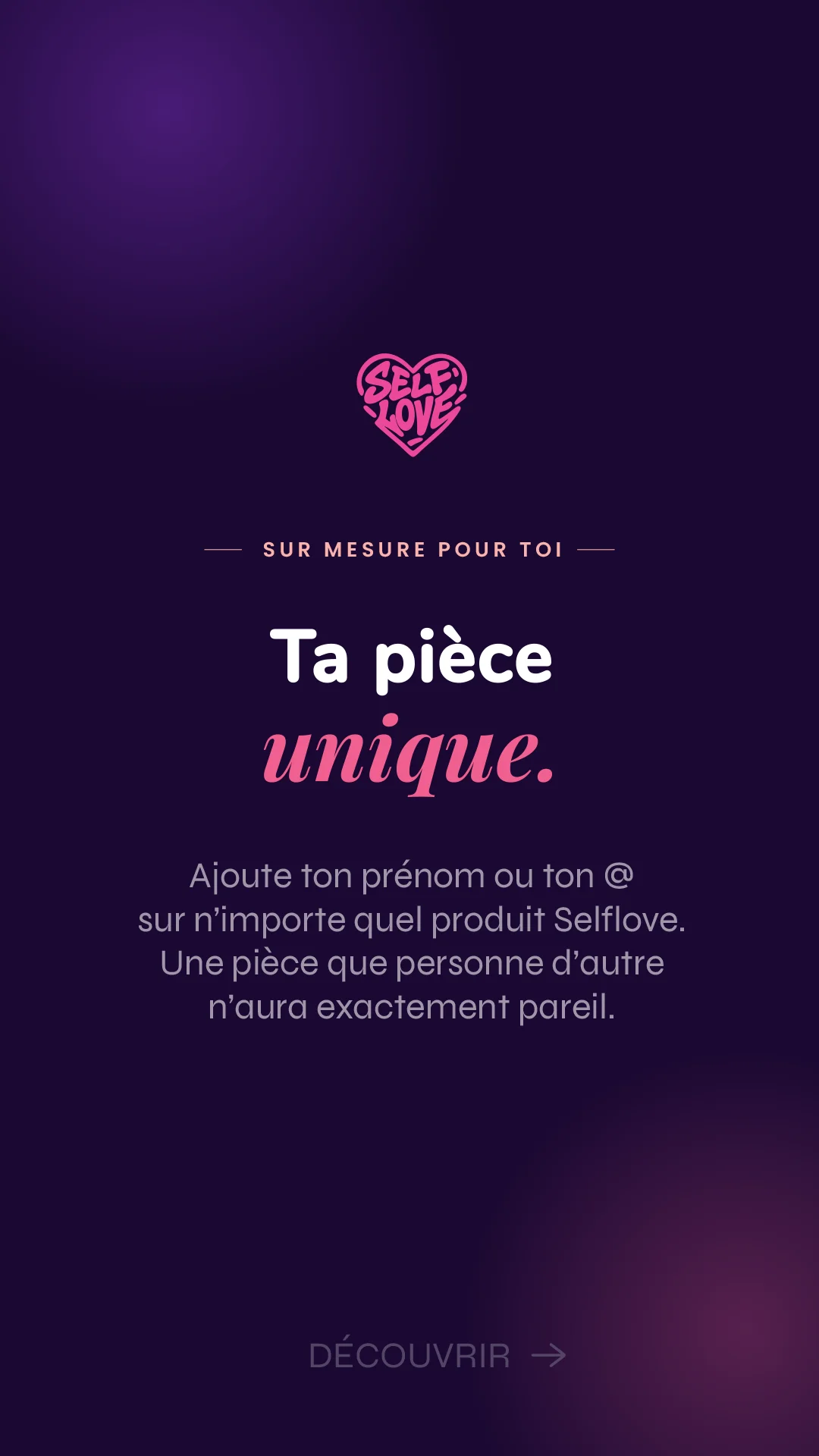
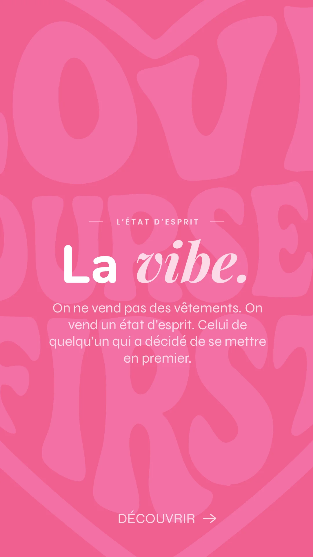
FEATURED STORIES


A controlled palette and a strong identity.
Messages that speak and create a bond.
Clean visuals for instant readability.
A universe that brings people together and inspires.
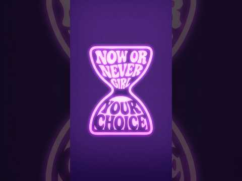
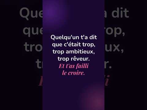
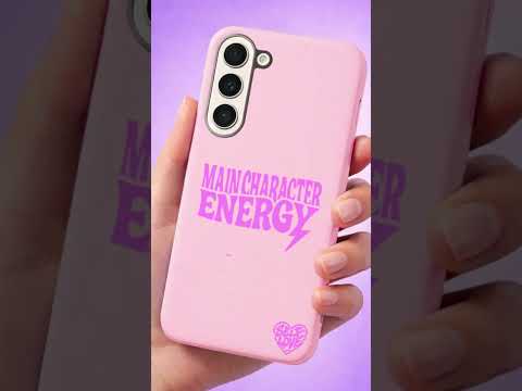
VIDEOS


05
A content direction designed to create a coherent, emotional and recognisable digital presence.
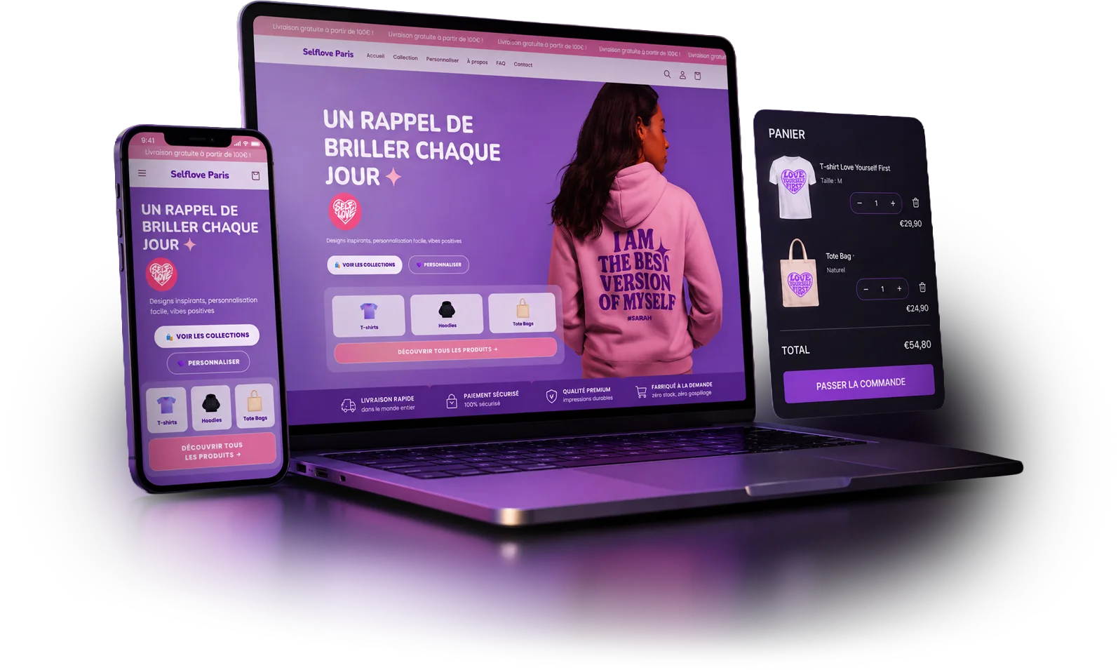
VIEW SITEA journey that tells a story.
Airy spaces that let the message breathe.
A simple, fast and pleasant experience.
An interface optimised for all screen sizes.
06
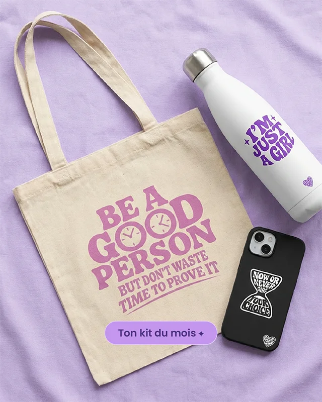
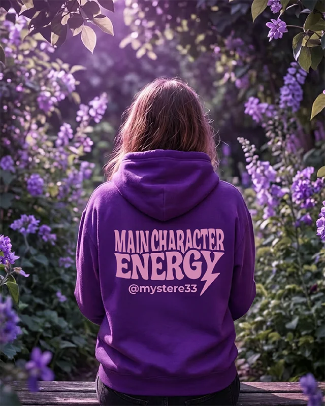
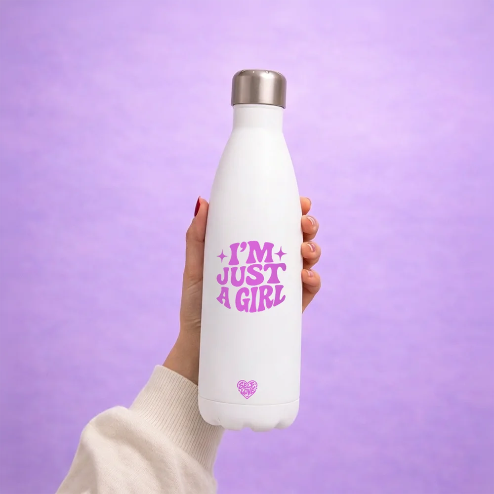
A clean and luminous photo direction that highlights the messages and the materials.
Natural and harmonious visuals.
Every detail matters.
Colours that stay true to the brand identity.